Typeface Tricks & Treats: 5 Spooky Fonts and When to Use Them
We love a good seasonal moment and if you’re in the mood to play with your visuals this October—fonts are a great place to start.
But just like costumes, not every typeface is built for everyday wear. Some are better suited for short-term campaigns, themed posts, or limited-run products—not full-on brand identities.
Here’s a breakdown of 5 Halloween-inspired fonts (aka: “typeface treats”) we love—and how to use them without scaring off your audience.
1. Witchy Serif: Cormorant Garamond
📌 Vibe: Elegant, slightly dramatic, moody
📌 Best for: Spellbound headlines, upscale Halloween menus, or fall lookbooks
Why we like it:
This font has just enough curve and character to feel seasonal—without being cliché. A good option when you want something elevated with subtle flair.
🧠 Studio Wellmade Tip: Pair it with a neutral sans serif to keep it modern. Avoid stacking it on multiple lines if readability is key.
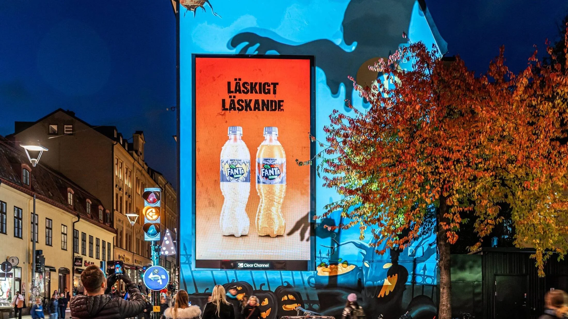
2. Gothic Decorative: Nosifer
📌 Vibe: Slime-drip horror movie titles
📌 Best for: Costume party invites, pop-ups, playful IG graphics
Why we like it:
It’s totally impractical for body text—but that’s the point. It makes a statement. Use it when you want something loud and fun for short bursts.
🧠 Studio Wellmade Tip: Don’t use it in your brand logo. Just... don’t.
3. Script But Make It Eerie: UnifrakturCook
📌 Vibe: Spooky elegance meets old spellbook
📌 Best for: E-invites, themed packaging, or folklore-inspired collections
Why we like it:
It toes the line between edgy and ornamental. With the right spacing and pairing, it can look haunting and high-design.
🧠 Studio Wellmade Tip: Great for merch or event titles, but keep it minimal for longform text.
4. Creepy Casual: Spooky Halloween Font by Woodcutter
(Available on sites like DaFont or Creative Market)
📌 Vibe: Cartoonish, fun, kid-friendly spooky
📌 Best for: Trick-or-treat flyers, themed product tags, or classroom events
Why we like it:
It’s playful, approachable, and clearly holiday-specific. Just don’t use it past October 31.
🧠 Studio Wellmade Tip: Great for seasonal email headers or shop signage—but keep it short.
5. Clean with a Twist: Playfair Display
📌 Vibe: Editorial, modern, slightly dramatic
📌 Best for: Brands that want seasonal flair without abandoning polish
Why we like it:
This isn’t a “Halloween font,” but it adapts well. Paired with burnt oranges or dark purples, it can carry a sophisticated spooky vibe without becoming a novelty.
🧠 Studio Wellmade Tip: Use it for fall campaign titles or limited-edition product packaging. It won’t disrupt your core identity.
When to Use Themed Fonts (and When Not To)
Use decorative or seasonal typefaces when:
You’re running a short-term promotion or event
You’re creating content just for social or email
You’re launching themed packaging or capsule merch
Avoid them when:
You’re building a core brand or identity system
You need high readability (especially on mobile)
You’re communicating with corporate or high-investment clients
Want Feedback on Your Brand’s Typography?
If you’ve been experimenting with fonts and feeling a little off—we can help.
Sometimes it’s not about a full rebrand—it’s about realignment and refining.
🧠 Studio Wellmade offers:
Brand Audits
Clarity Sprints
Full Design Intensives (if your visuals need a full refresh)


